Research
Security News
Threat Actor Exposes Playbook for Exploiting npm to Build Blockchain-Powered Botnets
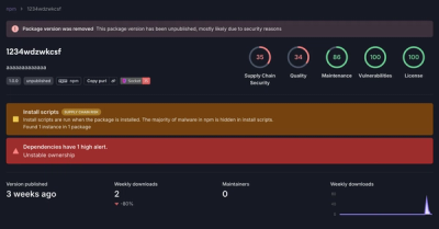
A threat actor's playbook for exploiting the npm ecosystem was exposed on the dark web, detailing how to build a blockchain-powered botnet.
@highlight-ui/utils-hooks
Advanced tools
A collections of React hooks that are used by UI-components in Personio
@highlight-ui/utils-hooksyarn add @highlight-ui/utils-hooks
This component is deprecated
A wrapper for the usePopper from the react-popper library.
Accepts a Popper.js options object as an argument and returns the styles and
attributes values from the usePopper hook. For convenience, the hook also
returns setReferenceElement and setPopperElement functions.
import { useAutoPositioner } from '@highlight-ui/utils-hooks';

const MyComponent = () => {
  const { setReferenceElement, setPopperElement, styles, attributes } =
    useAutoPositioner();

  return (
    <div ref={setReferenceElement}>
      <div
        ref={setPopperElement}
        style={{ ...styles.popper }}
        {...attributes.popper}
      ></div>
    </div>
  );
};
Calculating position of "floating" elements like tooltips, popovers, dropdowns, menus, and more.
Accepts a config as an argument and returns the styles, triggerRef and
floatRef functions.
type Options = {
  // Position of the element to the trigger element. Default: bottom-start
  placement: Placement;
  // Automatic position based on the space around the trigger. This overrides flip and placement options. Default: Disabled
  auto: AutoConfig | null | false;
  // Flip position if there is not enough space on the placement area: Default: Enabled
  flip: FlipConfig | null | false;
  // Offset from the trigger element: Default: Enabled
  offset: OffsetConfig | null | false;
};
import { useAutoPosition } from '@highlight-ui/utils-hooks';

const MyComponent = () => {
  const { triggerRef, floatRef, styles } = useAutoPosition();

  return (
    <>
      <div ref={triggerRef}>Trigger</div>
      <div ref={floatRef} style={{ ...styles }}>
        Floating tooltip
      </div>
    </>
  );
};
Wrap above useAutoPosition with interaction controls. Based on the config updated open property
Accepts a config as an argument and returns the styles, open,
getTriggerProps, getFloatProps, triggerRef and floatRef functions.
type Options = AutoPositionOptions & {
  // Auto open on hover. Default: Enabled
  hover?: HoverConfig;
  // Auto open on click.  Default: Disabled
  click?: EnableConfig;
  // Auto open on focus.  Default: Enabled
  focus?: EnableConfig;
  // Set role to automatically add a11y params to floater. Default: Disabled
  role?: RoleConfig;
  // Auto close.  Default: Enabled
  dimish?: EnableConfig;
};
import { useAutoInteractions } from '@highlight-ui/utils-hooks';

const MyComponent = () => {
  const { triggerRef, floatRef, styles, open, getTriggerProps, getFloatProps } =
    useAutoInteractions();

  return (
    <>
      <div
        ref={triggerRef}
        // Functions like onClick, onHover, ... are at risk of being overriden
        // to prevent that we add then into the getTriggerProps that will join
        // the props/callbacks if it needs/uses it
        {...getTriggerProps({
          onClick: () => {
            console.log('clicked');
          },
        })}
      >
        Trigger
      </div>
      {open && (
        <div
          ref={floatRef}
          style={{ ...styles }}
          // Functions like onClick, onHover, ... are at risk of being overriden
          // to prevent that we add then into the getTriggerProps that will join
          // the props/callbacks if it needs/uses it
          {...getFloatProps({
            onClick: () => {
              console.log('clicked');
            },
          })}
        >
          Floating tooltip
        </div>
      )}
    </>
  );
};
Allows multiple ref objects/callbacks to be combined so that they can be passed as a single callback ref.
import React from 'react';
import { useForkRef } from '@highlight-ui/utils-hooks';

const MyComponent = () => {
  const firstRef = React.useRef();
  const secondRef = React.useRef();
  const finalRef = React.useRef([firstRef, secondRef]);

  return <div ref={finalRef}></div>;
};
Allows attaching a click-outside listener to a target element.
import { useClickOutside } from '@highlight-ui/utils-hooks';

const MyComponent = () => {
  const onClickOutside = () => {
    console.log('clicked outside');
  };
  const setElement = useClickOutside(onClickOutside);

  return (
    <div>
      <span>Outer Div</span>
      <div ref={setElement}>
        <span>Inner Div</span>
      </div>
    </div>
  );
};
Allows attaching a scroll listener to a target element.
import { useScrollObserver } from '@highlight-ui/utils-hooks';

const MyComponent = () => {
  const onScroll = () => {
    console.log('scrolled');
  };
  const { setElement } = useScrollObserver(onScroll);

  return (
    <div>
      <span>Outer Div</span>
      <div ref={setElement}>
        <span>Inner Div</span>
      </div>
    </div>
  );
};
FAQs
A collections of React hooks that are used by UI-components in Personio
The npm package @highlight-ui/utils-hooks receives a total of 2,588 weekly downloads. As such, @highlight-ui/utils-hooks popularity was classified as popular.
We found that @highlight-ui/utils-hooks demonstrated a healthy version release cadence and project activity because the last version was released less than a year ago. It has 10 open source maintainers collaborating on the project.
Did you know?

Socket for GitHub automatically highlights issues in each pull request and monitors the health of all your open source dependencies. Discover the contents of your packages and block harmful activity before you install or update your dependencies.

Research
Security News
A threat actor's playbook for exploiting the npm ecosystem was exposed on the dark web, detailing how to build a blockchain-powered botnet.

Security News
NVD’s backlog surpasses 20,000 CVEs as analysis slows and NIST announces new system updates to address ongoing delays.

Security News
Research
A malicious npm package disguised as a WhatsApp client is exploiting authentication flows with a remote kill switch to exfiltrate data and destroy files.